Residente Branding
René Perez "Residente" is a Puerto Rican rapper, singer, writer, and filmmaker. Together with his alternative rap band "Calle 13" has won four Grammy Awards and 27 Latin Grammy Awards over the curse of his career.
For the release of his first solo album, he took a DNA test to find out about his own heritage and travel to all the countries he found out to have a connection with. Around the world, he met with locals and collaborated with different musicians to create all the songs of his new album.
I had the chance to collaborate with a small team at Hello Monday to create the branding guidelines, concept and use examples for his new solo career. From the logo to the use of typography and the new album cover (which won a 2018 Grammy for Best Latin Rock Album), we created a set of highly conceptual visuals inspired in the use of phonetic characters, travel documentations, world flags and the idea of world unity, beyond any skin color or countries.
We are all connected.
Client: René Pérez "Residente"
Year: 2017
Role: Design, Illustration, Animation
Collaborators: Steffen Christiensen (Art Direction), Chelsea Cox (Project Management)
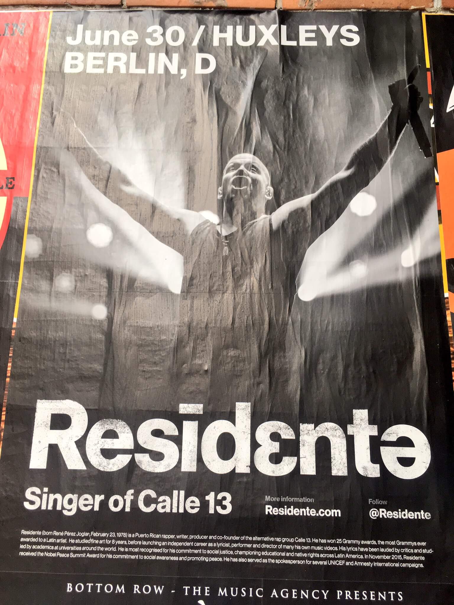
01 –––––––– Logo & visual elements
Three versions of the letter E were used in the word mark to represent the idea of diversity. It also serves as a reference for the many elements of our DNA and personal identities.


Helvetica Neue’s international characters were used creatively in typographic compositions to represent diversity the same way the logotype does, taking care it didn't affect basic readability of the sentence.
Helvetica Monospaced provides a nice visual counterpoint, resembling passport and international travel documentation.

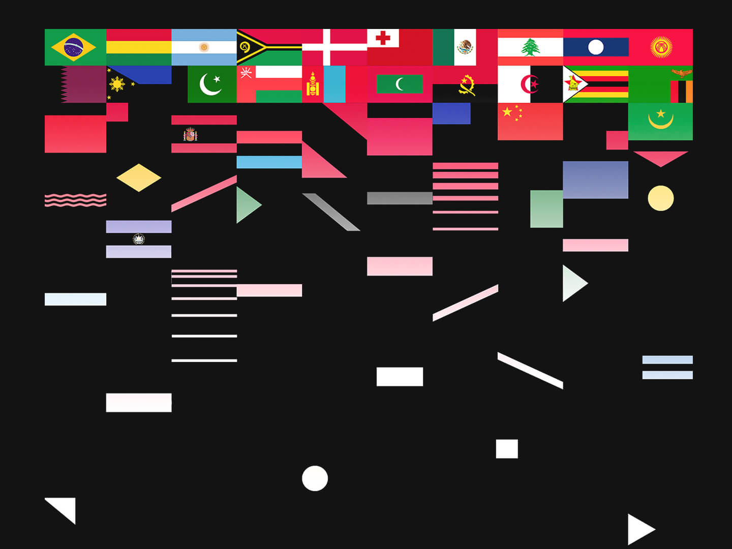
Inspired by the most common shapes in flags from around the world, colors were removed and geometry was broken into pieces.
Then a unique set of visuals were created to appeal for universality and unity beyond any physical boundaries.
All humans are made out from the same basic elements.


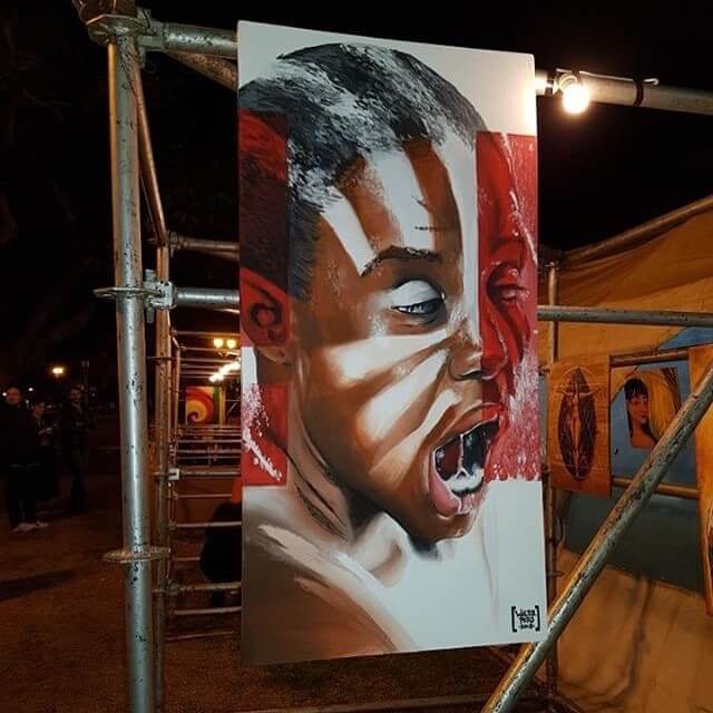
02 –––––––– Album cover
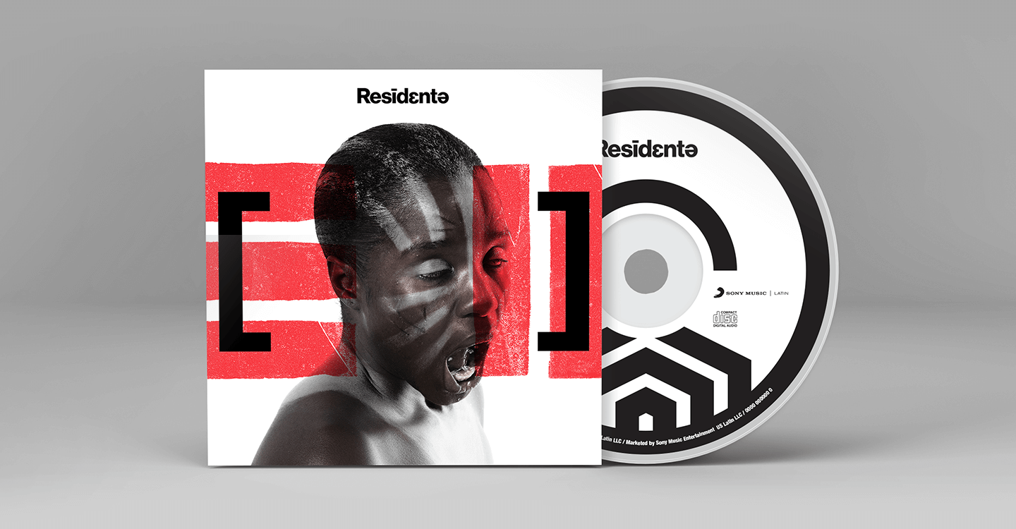

Following the same visual language, we experimented with different designs of face paint, which we used to challenge the concept of race and skin color, mixing it up with some of the flag shapes we created previously.
The use of a black woman as model is meant to reference humanity's own birth in Africa, and her facial expression was selected because of its ambiguity. It could be a scream or a laughter, birth pains or a sigh of relief.

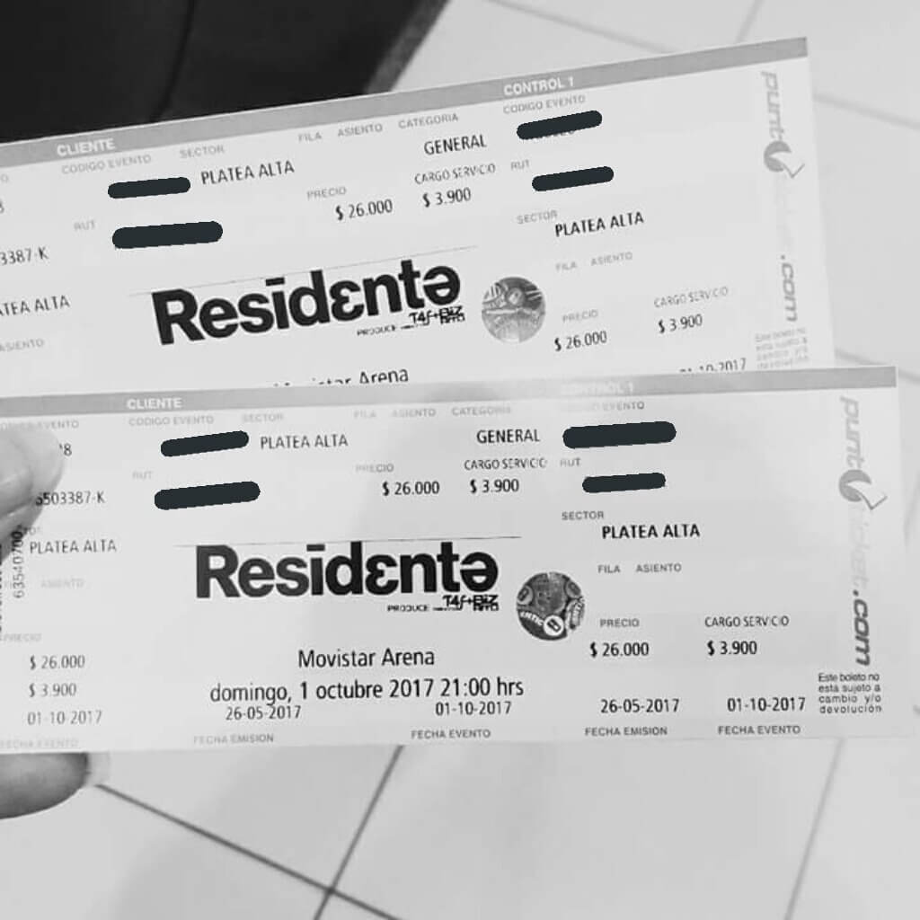
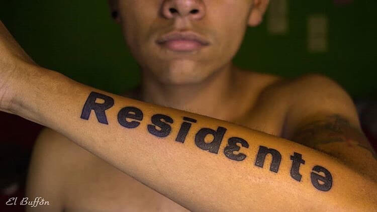
03 –––––––– IRL reactions