YouTube
Product Icons
I got the amazing opportunity to create together with my teammates at Hello Monday three different icons for some high profile YouTube verticals.
Throughout the process, we came up with a triangle grid based on the inner shape of the main YouTube logo, and used it as a guide to create these recognizable shapes and keep the connection with the mother brand.
The YouTube Music and YouTube Gaming icons were used all over the world in the computers and phones of millions of users. The YouTube go icon was used in selected countries also by a considerable amount of users.
The icons are not in use anymore, but they set the ground for the updated iterations that can be still seen in the main YouTube site and apps.
Client: YouTube
Year: 2015 - 2018
Role: Branding & Illustration
Collaborators: Hello Monday (Creative Direction), Jeff Stark (Creative Director)
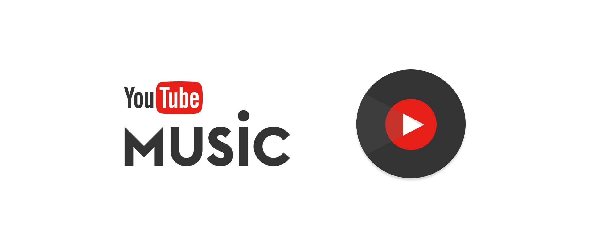
01 –––––––– YouTube Music
The YouTube Music icon is an abstraction of an LP record, a musical format that survives and thrives nowadays in world musical culture.
It borrows the main YouTube triangle and uses the grid to maintain balanced proportions with the two circles that surrounds it. A subtle hint of shine born from the central triangle was added to make the icon unique and recognizable.

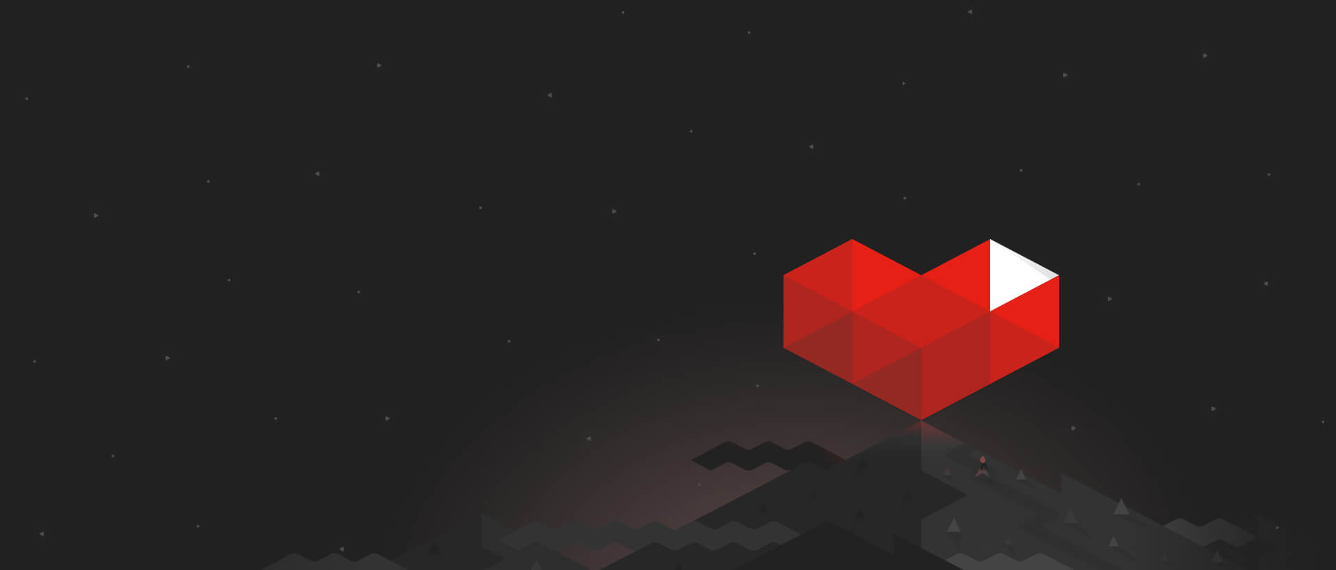
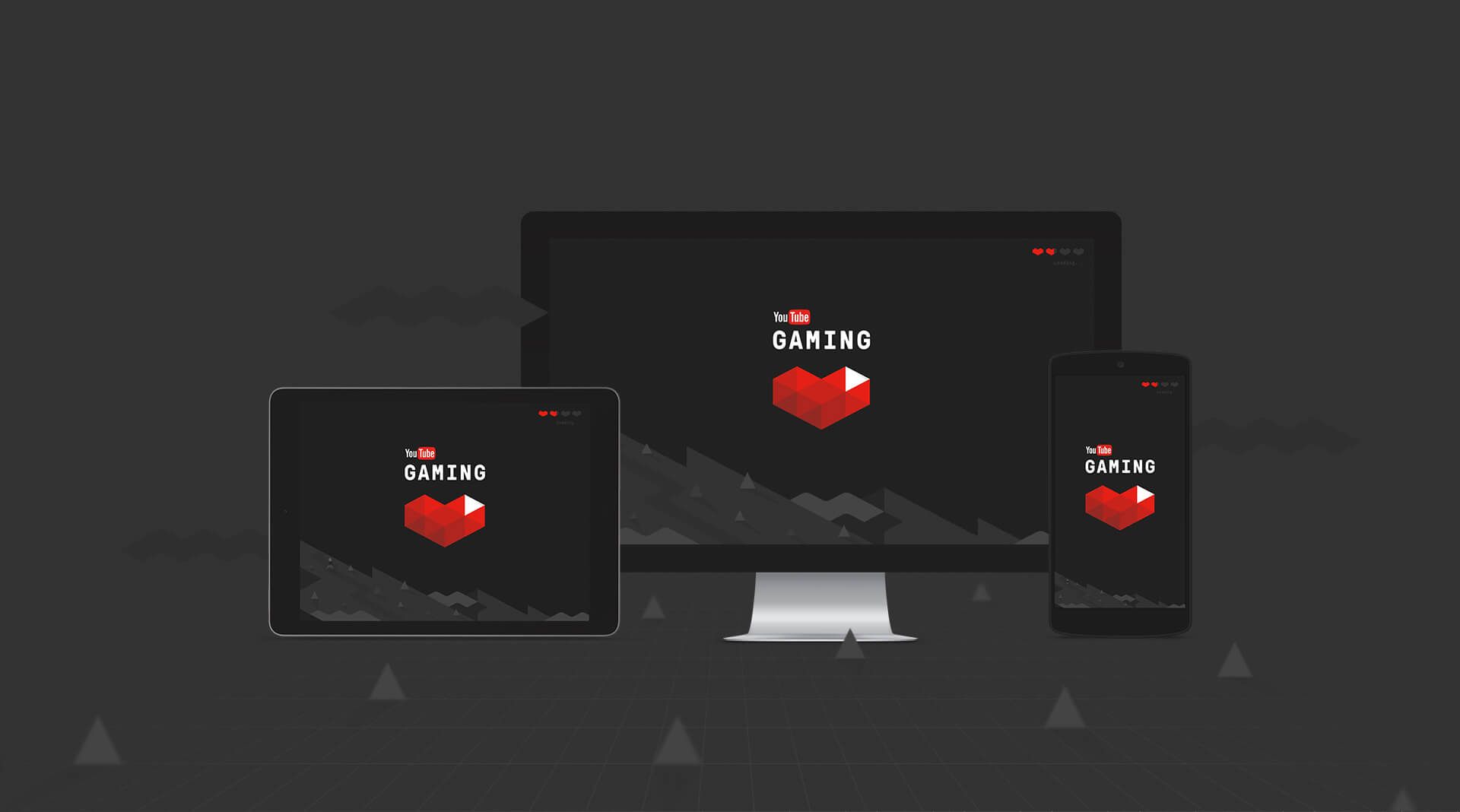
02 –––––––– YouTube Gaming
The challenge was to create an original, easily recognizable icon that kept a clear link to the YouTube mother brand, and at the same time have a clear reference to the world of gaming.
After many iterations, this version was chosen for being an interesting mix between two well known gaming references (health hearth + rupee) and coming straight from the YouTube triangle grid we were using as base.

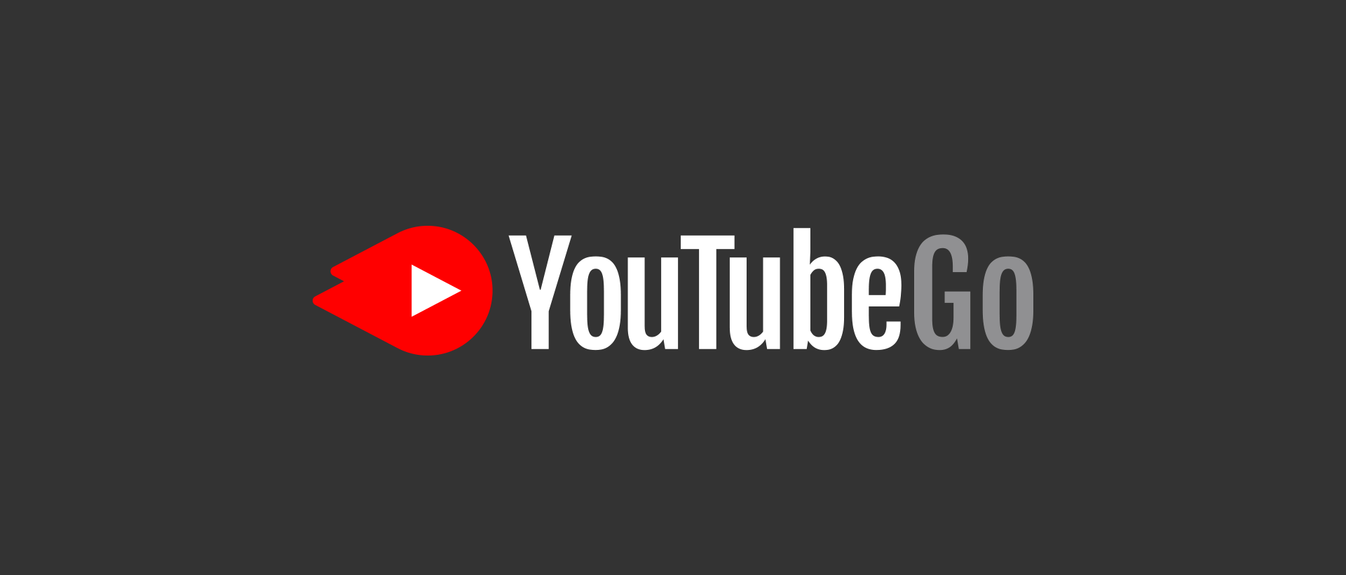
03 –––––––– YouTube Go
YouTube Go is a version of the YouTube app for mobile phones, that is specially created for users with limited internet access in countries in development. It is lightweight and has interesting capabilities like the possibility to download and share videos in local networks.
The logo resembles a fast “comet”, to communicate the lightweight and speed attributes of the app. The shapes on the tail of the comet are made out of two triangles flipped horizontally and positioned in alignment with the ratio of the original YouTube icon and the visual center of the circle.